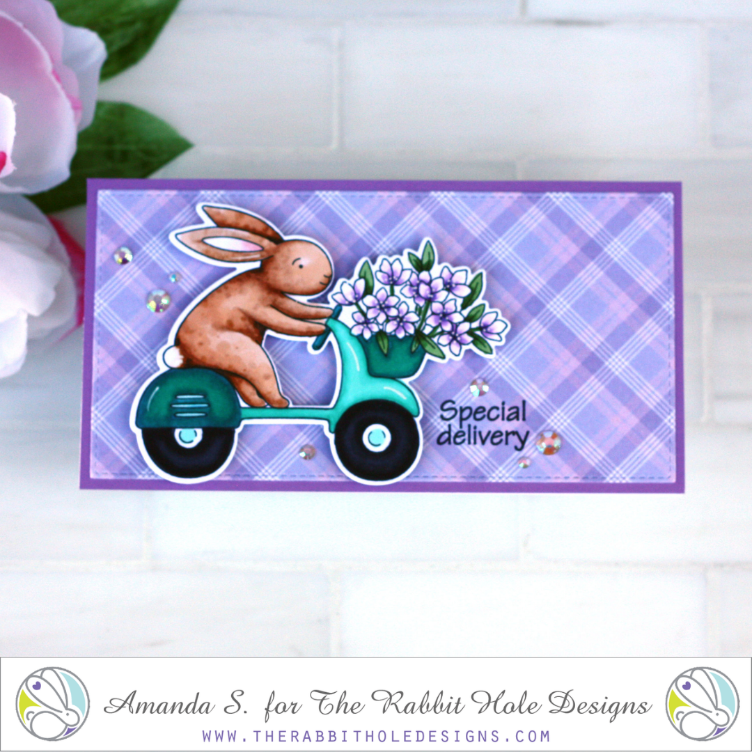
Hello my crafty friend! I’m back with another mini-slimline card today (you’re shocked, I know). Instead of creating a scene for my cute little bunny image, I used pattern paper to pull the card together. It’s a simple trick, but there are a few things to keep in mind so your image doesn’t get lost, and to make sure the paper actually coordinates.
Quite often when I get a new stamp set, I load all the images into my Misti, stamp them out, and Copic color them while I watch TV. Usually, I have no idea what I will do with the images at that point, so I cut them out and tuck them into the pocket with my stamp set, to have them ready for cards later. Using pattern paper for the background is a quick and easy way to turn precut/colored images into a card, but how do you make them stand out?
The first thing to think about with your focal image is how it’s fussy cut. In most cases, you’ll want a border, to help outline the image and allow it to pop, rather than blend into a busy background. Coordinating dies usually create that border for you. The ScanNCut can as well. In cases where there is a large portion of negative space that doesn’t get cut out by the die, it’s likely to be noticeable with a bold pattern paper background. You can trim that away yourself with a craft knife, or color in the area to match your pattern paper. Either way, make sure to carry the white border in around the inner parts of the image too. Luckily, the coordinating die for the Special Delivery bunny that I used today, cuts out the negative space in the center.
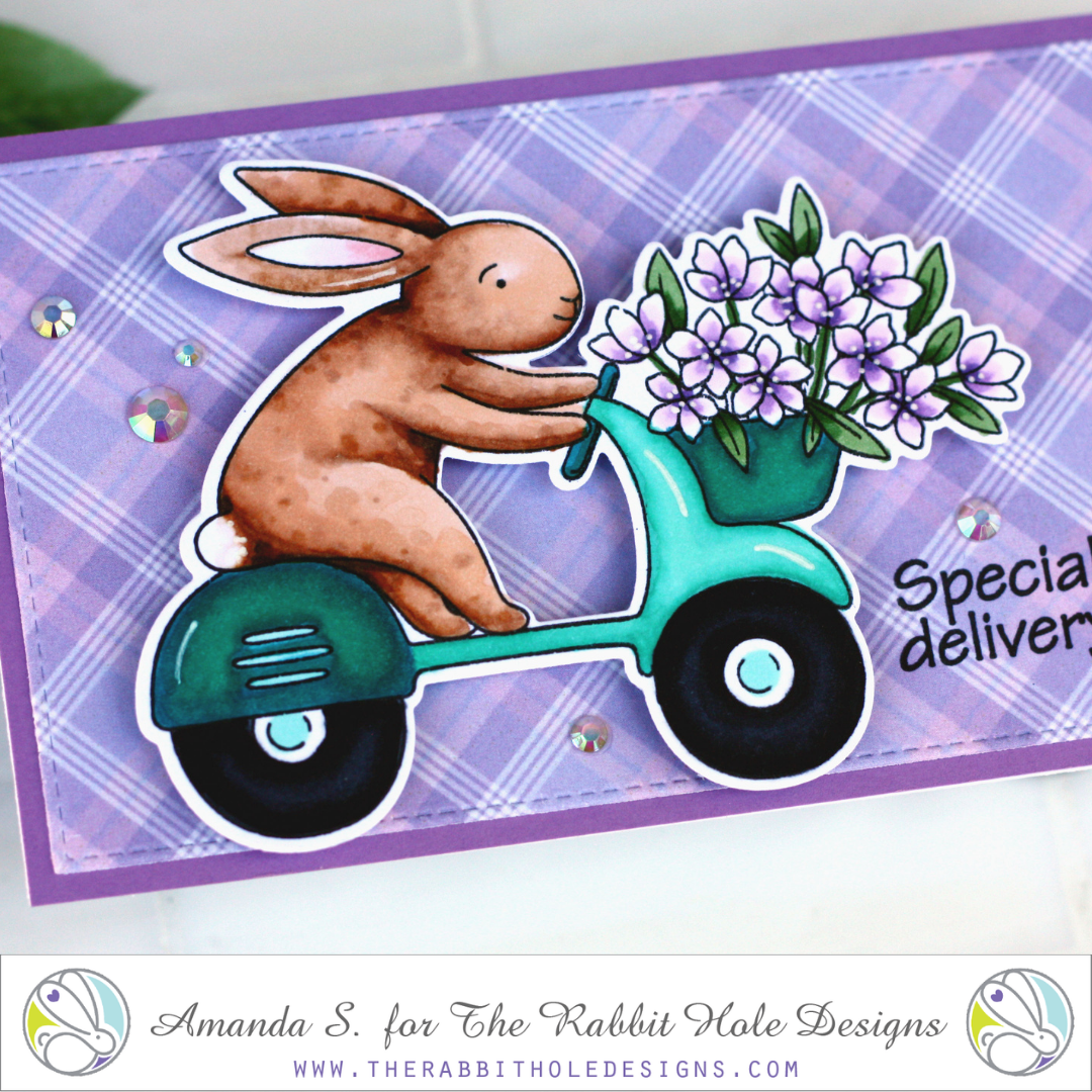
Next, it’s time to choose the right pattern paper. For colorful focal point images, I recommend monochromatic patterns that can act as neutral bases. Usually, plaids, stripes, polka dots, or tone-on-tone floral backgrounds are my favorites. You don’t want your focal image to have to compete for attention, so avoid patterns with lots of bold, colorful images. You also want the image to look at home on the paper (like they belong together), so try to find a pattern that has at least one accent color from your image. Avoid picking a background that is the same color as the main object in your focal image, or it may not pop enough. In today’s card, you can see that I picked a plaid pattern paper that matches the purple flowers in my focal image. Alternatively, green or white pattern paper would have worked as well. If I wanted to use brown or teal pattern paper, they would have to be much softer shades than the bunny or Vespa, or I would need to layer a piece of vellum in between.
Found a paper that is almost right, but the colors don’t quite work together? Alter one! In my card today, I could have colored over the purple flowers to make them more pink or blue, if I needed to get them to the right shade. Or I could have ink blended on top of the pattern paper to alter the tint. If the pattern was too bold, blending a medium or dark shade of ink over the whole thing would have toned it down. (For more ideas on how to use pattern paper, check out this video.)
Now that you have the right image and pattern paper combo, there are two more things to remember. Elevation is essential; pop your image up with foam tape, or better yet, double thick foam tape! I can’t tell you how much of a difference that makes. Nothing helps an image pop off the page as much as actually popping it off the page. And then of course, is the matter of your sentiment. As long as your pattern paper is fairly neutral, you should be able to stamp, or emboss directly on it. Pick an ink, or embossing powder with as much contrast as possible. Here I used the same black ink that I stamped my image with because my purple paper was light. If I were using a dark paper, I might have embossed white on top. In cases where the pattern paper is too busy, stamping on a strip of cardstock and layering it in place makes more sense. A few gems can connect the image to the sentiment and add sparkle.
Thanks for stopping by today! I hope these tips will help you put more of your pattern paper to use, and take some of the frustration out of picking the right ones. Let me know in the comments below if you have any questions, or if you have any other tips for pattern paper.
My sample card today features the Special Delivery Stamp Set, Coordinating Die, and Spring Floral #1 Paper Pack from The Rabbit Hole Designs.

I’ll be back soon with another fun card to share.
This site uses affiliate links whenever possible (at no additional cost to you), but only for products I actually use and love.

Really wonderful info here for those of us who relish easier cards because we have tons to send out! Some of your suggestions I have discovered on my own but never really thought about them until you called them out. As always, so very helpful for the starters and oldies at card making as well. Thanks so much Amanda!